“Non-Places” – Book Jacket Design

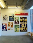
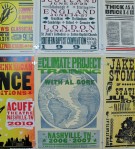
One of the Graphic Design projects at college was to design a cover for a book by Marc Augé titled “Non-places: Introduction to an Anthropology of Supermodernity”. Marc Augé coined the phrase “non-place” to refer to places of transience that do not hold enough significance to be regarded as “places”. Examples of a non-place would be a motorway, a hotel room, an airport or a supermarket”

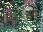
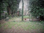
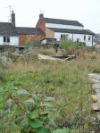
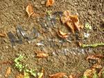
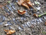
First thing we had to do the day we were set this project was to go around Banbury for few hours and take as many photographs of Non-Places as possible. Since I had never heard the term ‘Non-Place’ before and so never paid any attention to any “Places?” like that, I was a bit worried that I wont be able to find anything interesting to photograph but luckily I was wrong..very very wrong! After few hours of wandering around Banbury I had a set of almost 200 photographs of Non-Places! And looking for them can definitely be classified as an adventure! I’m not going to post all of them because (that would take ages!) they are not all that great but just so you can get an idea of what I found, just a few examples!

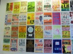
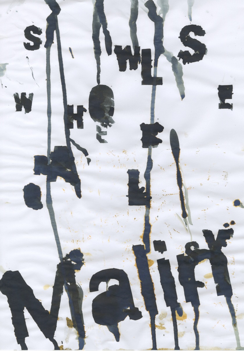
Unfortunately, I don’t have a digital copy of my development work for this project..well, I probably do but I can’t find it at the moment (what a surprise!) so below you can find my final Book Cover Design which I really hope you like, and I promise to update this post as soon as I will find my development! So, thank you for reading and please look forward to my next post!

Typographic Posters in London

Today I was going through some old folders full of photographs I took while I was still at college and I discovered quite a few things that I was actually planning to write about but never did. For example, I remember in February I went to London for my university interview at Chelsea College of Art. (It was actually my first interview and I was really stressed) But after the interview I had a lot of spare time on my hands so I thought its a great opportunity to visit some Art Galleries without being rushed by anyone. Unfortunately my portfolio was so heavy that a barely could walk (I swear it wasn’t so heavy when I was leaving home!) So, in the end the only place I went to before going back home (Noooo..sooooo many things I could have done in London if I didn’t have this massive folder with me!) was a little University Gallery right next to it. So even though I didn’t get do anything exciting that day at least I was lucky enough to see all those awesome posters! And here they are:

I was also really happy because the weather in London was surprisingly nice that day!

Soo, thats it for today. Thank you for reading, I hope you liked all those great poster (of course you did!) and are looking forward my next post…maybe.. tomorrow?


Graphic design – Shipping forecast (week 2) – Media experimantation

Recently I promised to write about our second mini project for graphics so, here we go!!

Our starting point was the same as the week before: Shipping forecast for a random shipping location. This time however we were asked to experiment with whatever methods we want to create our designs and so our creativity wasn’t limited to a computer design. Yep, I know it sounds Exciting!

MalinThe shipping forecast for Malin:

Wind: northwesterly 5 to 7.

Sea State: rough or very rough.

Weather: squally showers.

Visibility: moderate or good.

At first I wanted to design a poster using InDesign and then work on it with pen but when I created the first design on computer I decided to change my strategy and be more experimental. So, on the right you can see the first design that  I created that day, before I decided to change my way of working:

In my next designs I decided to use only a part of the shipping forecast rather than the whole text and I ended up with a short: “Malin squally showers” I then begun to think about how I can arrange the letters to make them visually express their meaning. I still decided to use InDesign to create the initial arrangement of the text. I then experimented with different methods and here are some examples of what I created:

I also used one spare copy of my design and cut out the letters to create a stencil. I didn’t like the effect that much but I decided to do some further experimentation using the letters I cut out. As it was raining at the time a had a perfect opportunity to use a wet ground as the background for my letters and I think I managed to create some interesting designs.

So here is the design created using stencil (the one that didn’t work too well)Experimenting

..and these are the photographs I took outside:

I know, they look awesome!..but putting them on the wet ground was a disaster as they kept rolling up! Before I managed to do anything I ended up with a pile of letters that looked pretty much like that:..it probably wouldn’t be that bad if not the fact that it was raining, my umbrella was heavy, my camera was running out of battery..and I also had to keep it clean and dry which was really difficult since my hands were covered in mud…uff

Oh yes! While I was putting the letters on the ground, another of my ideas was getting wet on the road (purposely of course). While I was still in the classroom I quickly painted one of the spare copies of the design with the quink ink as I was curious what effect I can achieve if I put it outside, on the muddy road on this rainy day. And hey! I did it purely out of curiosity but it turned out to work quite well!..And I also have one of the works that I created by accident when I crumbled a spare wet copy of my design..which was also covered in mud as I kept my letters on it after I used them!.. I know I shouldn’t make this post any longer..but just have a look okay!

So, that’s it for now! I hoped you liked it and look forward to my next post!:)

Graphic design – Shipping forecast (week 1)

Last week we had a lot of fun making a typographical poster using shipping forecasts for a range of different shipping locations. Since it was our first graphic design lesson and almost none of us ever used InDesign programme, we were asked to take our shipping forecasts and just experiment with different font types, sizes, colours and layouts.

We were taught some very useful keyboard shortcuts that make working with this program much quicker and easier. Being able to explore different artists works we had opportunity to get lots of inspirations and ideas which then helped us with making our designs more interesting and visually appealing!

Here is the shipping forecast for Sole. Issued: 10 September 04:05 UTC

Wind: Northerly or north-westerly 5 or 6, ocasinally 4

Sea State: Slight or Moderate

Weather: Showers

Visibility: Good

And here are some examples of my posters:

Even though I enjoyed this mini project I don’t really like the outcome of it. I decided to experiment some more and then I will decide which poster to use as my final design.

Also, I will soon make a post about the second mini graphics project (also to do with shipping forecast though) that we were asked to complete two days ago and which in my opinion was a way more exciting and creative! So far it was my favourite ‘mini project’ so look forward to see the outcome of it!