Experimental Drawing – Study of Clouds

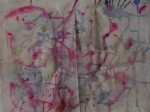
Continuing from my previous post about our first session of experimental drawing I’m going to write about what we did on our second session a week later…which to be honest I found much more interesting and enjoyable. There were two things that made me really like this project. Firstly just like in our first session we were asked to work with black and white media only and to be as experimental as we want which is what I like doing the most! And secondly, we had to do a study of clouds, and clouds are amazing and I love them. I love everything to do with sky and clouds so I guess it was just impossible for me to dislike this project! But anyway, in my case I decided to limit myself and use only black and white chalk and white acrylic paint as I could still remember the overworked drawing I created on the first session (click on the link in the first sentence if you would like to read more about it!)

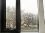
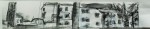
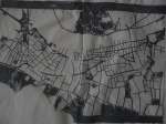
Before creating our own pieces using any media we want, we were all asked to do two A2 drawing of clouds using two different techniques chosen by our tutor. At the start of the session we were all given an A4 black and white photocopy of a photograph of clouds and for the first drawing we were asked to choose a small rectangular section of it (about 2cm by 3cm) and using only black chalk interpret it on A2 piece of paper. The trick was we were not allowed to even use rubber so we had to be very careful to make sure we don’t make it too dark because it would be really hard to make it lighter again. The drawing below is the one I created (but actually wasn’t very happy with as it looks nothing like clouds)

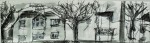
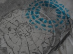
For the second drawing we were asked to choose a different section of the photocopy (but about the same size) and again interpret it on A2 piece of paper. This time however we had to cover a whole piece of paper with a layer of black chalk and “draw” clouds using a putty rubber. I must say I preferred this techniques a lot as I felt I have more control over what I’m doing..(I probably shouldn’t since it was experimental drawing workshop but oh well) Anyway, here  it is:

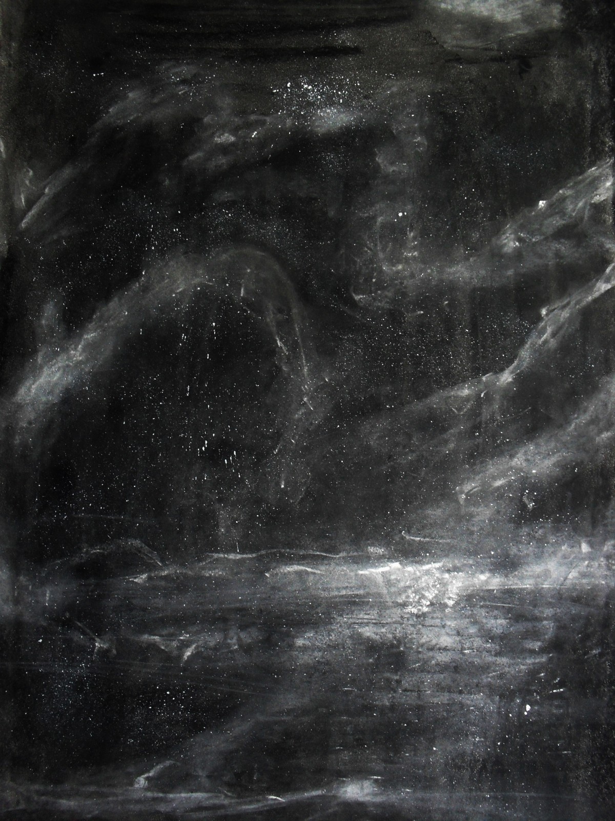
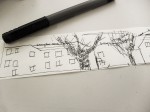
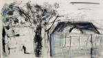
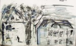
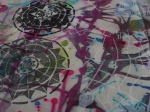
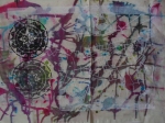
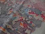
So, Once we finished creating those two pieces of work we could start working on our own ideas. As I mentioned before I used only black and white chalk and white acrylic paint as I tried to be sensible this time, and so I ended up with a drawing I actually liked (wow, it literally never happens!) So below you can see a drawing I created and two close ups on the details.

Drawing – 

Details-

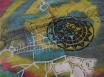
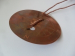
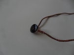
Lastly, during the same session we also created our own blackboards using pieces of cardboard boxes and blackboard paint. To be completely honest I can’t remember what exactly it was about but we explored some kind of mark making on blackboard as there are a lot of artists who use blackboards in their work and it creates a really interesting effect. But anyway, once our blackboard were dry and ready to use we were asked to be very experimental and to express our thoughts by creating abstract pieces of work. As I said I can’t exactly remember what it was all about but below are the two pieces I created. So, I hope  you enjoyed reading this really long post and maybe liked my drawings..well at least the one I liked! Have a nice day (..night?) and please look forward to my next post!


“Non-Places” – Book Jacket Design

One of the Graphic Design projects at college was to design a cover for a book by Marc Augé titled “Non-places: Introduction to an Anthropology of Supermodernity”. Marc Augé coined the phrase “non-place” to refer to places of transience that do not hold enough significance to be regarded as “places”. Examples of a non-place would be a motorway, a hotel room, an airport or a supermarket”

First thing we had to do the day we were set this project was to go around Banbury for few hours and take as many photographs of Non-Places as possible. Since I had never heard the term ‘Non-Place’ before and so never paid any attention to any “Places?” like that, I was a bit worried that I wont be able to find anything interesting to photograph but luckily I was wrong..very very wrong! After few hours of wandering around Banbury I had a set of almost 200 photographs of Non-Places! And looking for them can definitely be classified as an adventure! I’m not going to post all of them because (that would take ages!) they are not all that great but just so you can get an idea of what I found, just a few examples!

Unfortunately, I don’t have a digital copy of my development work for this project..well, I probably do but I can’t find it at the moment (what a surprise!) so below you can find my final Book Cover Design which I really hope you like, and I promise to update this post as soon as I will find my development! So, thank you for reading and please look forward to my next post!

Constructed Textiles and Yarn Bombing Collaboration!

One of the first..and probably one of the most exciting  projects we did at college was Constructed Textile project which somehow turned into and amazing yarn bombing collaboration! And if you have never heard of yarn bombing, you should definitely google it..or better click here!  But anyway, on the very first day of the project I finally learned how to knit! (some people were already amazing at it! but How?!)..So we hand and machine knitted..we made felt, we made sailing knots..and we also learned how to finger-knit from our friend Anna! And, finger knitting is what took this already great project to a whole new level!

Im not going to go in details about how and why and who came up with this amazing idea because that’s not really that important since it was a collaboration and everyone worked really hard on it (..and also because I just cant remember) but anyway! For the final piece we decided to make a lot of long pieces of finger knitting (It’s surprisingly quick and easy way of knitting!) and some machine knitted pieces and use the idea of yarn bombing to secretly decorate the most popular space in our college! Soo, we took all the pieces we knitted, tied them together and during the lesson we quickly put it up. And this is what it looked like:

And the best part isn’t the fact that when the lesson finished no one could figure out what was it all about and how did it get there but the fact that it made college look more Christmassy (and it was that time of the year) and so we didn’t have to take it down, right after we created it..in fact it was taken down after few months and only because the space was needed for the end of the year show! And most importantly it really was a big part of our college life because since we put it up until the very end we secretly kept adding to it so it was an ongoing project which a believe almost everyone at college really liked and got attached to. Even if they didn’t quite know why it was there! Below I included some more pictures where you can clearly see how it evolved! So I hope you like it, and please look forward to my next post!

About Photograms…and new Oxford Brookes Building!

Today I went to Oxford to meet Nari, my Korean friend and teacher. We spent few hours studying Korean in The John Henry Brookes Building which I really love because its modern, spacious and provides a great study environment. Every time I go there I’m more and more excited about joining Brookes next month! You can watch the video below and you will know exactly what I mean!

But anyway, since I didn’t have much time today and looking through my older posts I realized that I never posted any pictures of my final photograms that I created (or chose) for our photograms project, I decided that this is a perfect opportunity to do it because they are there..in the folder just waiting for me to upload them..and they don’t need that much explaining either. So I just hope you like them and are looking forward my next post!

Typographic Posters in London

Today I was going through some old folders full of photographs I took while I was still at college and I discovered quite a few things that I was actually planning to write about but never did. For example, I remember in February I went to London for my university interview at Chelsea College of Art. (It was actually my first interview and I was really stressed) But after the interview I had a lot of spare time on my hands so I thought its a great opportunity to visit some Art Galleries without being rushed by anyone. Unfortunately my portfolio was so heavy that a barely could walk (I swear it wasn’t so heavy when I was leaving home!) So, in the end the only place I went to before going back home (Noooo..sooooo many things I could have done in London if I didn’t have this massive folder with me!) was a little University Gallery right next to it. So even though I didn’t get do anything exciting that day at least I was lucky enough to see all those awesome posters! And here they are:

I was also really happy because the weather in London was surprisingly nice that day!

Soo, thats it for today. Thank you for reading, I hope you liked all those great poster (of course you did!) and are looking forward my next post…maybe.. tomorrow?


Experimental Drawing and Mark Making – old college project!

Since my course at Uni doesn’t start until mid September I’ve collected some photos from college and decided to start writing about some of the project that I did during my Art Foundation course. Some of them are actually pretty old so I hope I can remember what they were actually all about!

Okay, so one of the college projects that I never got to write about was a 3 day Experimental Drawing project where we experimented with a range  of different ways of mark making, different ways of drawing lines (you would be surprised how many there actually is!) and with taking sections of our drawings and interpreting  them on a big scale.  We were asked to use only black and white colours but we could use any media we want, and the more media variety the better!  I must say I really enjoyed this project even though I’m usually not that experimental when it comes to Art. (Well, I definitely improved a lot while I was at college!).

So, first thing we were asked to do was to sit by the window as this is what we were going to draw.

Then we were given a long piece of receipt paper to draw on which was quite surprising tbh! Starting on one side we were asked to draw all vertical lines first and nothing else.. so it was really important to keep some kind of proportions. Once we finished we were asked to do the same thing but with the horizontal lines..then diagonal, and then we could add trees and some other details that we felt we needed. At some point we were also asked to add some writing by for example writing ‘tree’ few times on the actual drawing of a tree and so on.

Here are some of the sections of my drawings after I added more details into it and more shading.

When  the drawing was finally finished we had to choose one section and interpret it on A1 piece of paper. I decided to go with this one: 

I took some photos while I was interpreting this little drawing on a much bigger piece of paper and by accident I documented how from a quite a good start that I was happy with I got to a heavily overworked drawing that I didn’t really like..oh well.

I feel like I really shouldn’t make this post any longer (Wow, if you’ve just finished reading it all!) so, I’m gonna end it with a page from my journal covered with pattern I created that day using quink ink and crumbled piece of newspaper.

University sorted..Finally!

ucasWhoooop! Finally..finally my place at University is confirmed, student finance is sorted, and my halls application sent!

Since I already finished college I’ve decided to start running this blog once again and maybe blog more frequently this time (In my case even one post every three months would be an improvement..whoops!)

So from now I will probably be writing about my University in general, project..maybe any self-directed projects as well as anything else that I want to share with the world! I will also try to make some posts about my old pathway stage projects from college and of course my Final Major Project! (I got Merit btw!) So, hopefully this time I will be able to stick with the plan..and post something at least..lets say once a week!

Amsterdam

After a very long time of not posting anything as I was very busy writing an essay about Tradition and Originality as well as writing my personal statement which I think was even more difficult..and obviously applying for universities and preparing my portfolio I have finally decided that its time to catch up and start running this blog properly.

I think writing about our recent overseas trip to Amsterdam is a perfect way to start! The trip unfortunately was only 5 days long but it was enough to visit quite a few truly amazing museums and Galleries. It is really difficult for me to decide which place was my favourite but for now I’ll just say that I absolutely loved Vincent Van Gogh Museum. Firstly becasue I’m really interested in Japanese culture and seeing Japanese art influencing western Art and someone like Vincent Van Gogh is very fascinating. Secondly, I actually wrote about some of his works that were inspired by Japanese woodblock prints in my personal study which I was writing while I was at Sixth Form, and now I had an opportunity to see them in real life which was just amazing. 

 The picture on the left is an original print by Hiroshige and the one on the right is Flowering Plumtree (after Hiroshige) (1887) by Vincent Van Gogh. In his copy he changed the colour a little bit and added borders filled with calligraphic characters he borrowed from other prints. Later on I will write some more posts about all the different places we visited and about our exciting ‘Bike seat cover’ project but for now some photographs of Amsterdam.

Printed textiles

The two-day printed textiles project was one of those projects where we could be as experimental as we want which means that for me it was very interesting and enjoyable. The aim of it was to produce a map that would lead for Christopher Columbus  to the New World. We experimented with three different screen printing techniques that we could then use to make our map.

First technique was Polychromatic screen printing which is when you paint whatever you want to print directly onto the silk screen. (The colours in this technique are very vivid so its important to remember that if you want lighter colours you need to use water to paint the screen first). Once the design is on the screen you wait for it to dry and then use a binder to print it on the fabric.

Second technique was Stencil printing for which we had to design and make a stencil. To print using this technique you have to masking tape the stencil onto the middle of the silk screen and then put the newspaper around it so the ink will only go through the stencil.

Third  technique was Photographic printing which allows you to print more detailed designs and you can print as many copies as you want since the design is created permanently on the screen. The design can be created on computer and it is important to remember that the machine that puts the design on the screen recognizes only black and white colour so our design shouldn’t have any colors or shading but only strong shapes. Below I included some of the experiments that I created that day so i hope you like them!:)

Navigational instruments

Some time ago at college I had the opportunity to do some metal work which to my surprise I really enjoyed. For this project we were looking at navigational instruments and we were asked to design and create our own navigational instrument using either aluminium, copper or brass.  After we covered the basics of how to work with metal and how to safely use the tools that we were given we were asked to experiment with as many different ways of working with metal as  we can. My final outcome of this project was a compass-necklace that I designed and made using copper..and one black button.