Graphic design – Shipping forecast (week 2) – Media experimantation

Recently I promised to write about our second mini project for graphics so, here we go!!

Our starting point was the same as the week before: Shipping forecast for a random shipping location. This time however we were asked to experiment with whatever methods we want to create our designs and so our creativity wasn’t limited to a computer design. Yep, I know it sounds Exciting!

MalinThe shipping forecast for Malin:

Wind: northwesterly 5 to 7.

Sea State: rough or very rough.

Weather: squally showers.

Visibility: moderate or good.

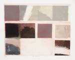
At first I wanted to design a poster using InDesign and then work on it with pen but when I created the first design on computer I decided to change my strategy and be more experimental. So, on the right you can see the first design that  I created that day, before I decided to change my way of working:

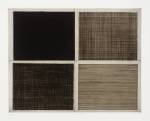
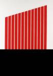
In my next designs I decided to use only a part of the shipping forecast rather than the whole text and I ended up with a short: “Malin squally showers” I then begun to think about how I can arrange the letters to make them visually express their meaning. I still decided to use InDesign to create the initial arrangement of the text. I then experimented with different methods and here are some examples of what I created:

I also used one spare copy of my design and cut out the letters to create a stencil. I didn’t like the effect that much but I decided to do some further experimentation using the letters I cut out. As it was raining at the time a had a perfect opportunity to use a wet ground as the background for my letters and I think I managed to create some interesting designs.

So here is the design created using stencil (the one that didn’t work too well)Experimenting

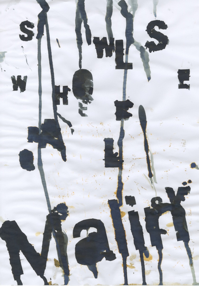
..and these are the photographs I took outside:

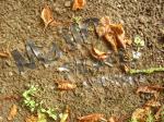
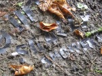
I know, they look awesome!..but putting them on the wet ground was a disaster as they kept rolling up! Before I managed to do anything I ended up with a pile of letters that looked pretty much like that:..it probably wouldn’t be that bad if not the fact that it was raining, my umbrella was heavy, my camera was running out of battery..and I also had to keep it clean and dry which was really difficult since my hands were covered in mud…uff

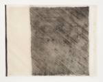
Oh yes! While I was putting the letters on the ground, another of my ideas was getting wet on the road (purposely of course). While I was still in the classroom I quickly painted one of the spare copies of the design with the quink ink as I was curious what effect I can achieve if I put it outside, on the muddy road on this rainy day. And hey! I did it purely out of curiosity but it turned out to work quite well!..And I also have one of the works that I created by accident when I crumbled a spare wet copy of my design..which was also covered in mud as I kept my letters on it after I used them!.. I know I shouldn’t make this post any longer..but just have a look okay!

So, that’s it for now! I hoped you liked it and look forward to my next post!:)

Painting

Recently at college I started another mini project this time mainly focused on painting. I was asked to create 4 A5 collages and make photocopies of them. Out of the photocopies I made I had to choose two and using only 5 colours (Black, dark grey, mid grey, light grey and white) I had to paint these on A4 piece of paper each. When two paintings were finished I was then asked to choose one of the paintings, photocopy it and then paint the photocopy on another piece of A4 paper.

At this stage we were finally allowed to introduce some colours.Exciting!! However we could only use blue and yellow..and only if we wanted to. So I scanned the last painting I created and started to paint it on A2 piece of paper which was much bigger than paper I used before.

The aim of this project was to learn different techniques of painting and mark making. We also learned about how different people interpret the same thing differently according to their own personality, experiences and likes.

So here are some photographs to illustrate each stage I went thorough in this project:

I will soon post the picture of the finished blue and yellow painting!


Graphic design – Shipping forecast (week 1)

Last week we had a lot of fun making a typographical poster using shipping forecasts for a range of different shipping locations. Since it was our first graphic design lesson and almost none of us ever used InDesign programme, we were asked to take our shipping forecasts and just experiment with different font types, sizes, colours and layouts.

We were taught some very useful keyboard shortcuts that make working with this program much quicker and easier. Being able to explore different artists works we had opportunity to get lots of inspirations and ideas which then helped us with making our designs more interesting and visually appealing!

Here is the shipping forecast for Sole. Issued: 10 September 04:05 UTC

Wind: Northerly or north-westerly 5 or 6, ocasinally 4

Sea State: Slight or Moderate

Weather: Showers

Visibility: Good

And here are some examples of my posters:

Even though I enjoyed this mini project I don’t really like the outcome of it. I decided to experiment some more and then I will decide which poster to use as my final design.

Also, I will soon make a post about the second mini graphics project (also to do with shipping forecast though) that we were asked to complete two days ago and which in my opinion was a way more exciting and creative! So far it was my favourite ‘mini project’ so look forward to see the outcome of it!

Intaglio and relief printing

On our first day back at college after the trip to Aberystwyth we started to learn about relief and intaglio printing. The main difference between these two methods of printing is that with relief printing we need to make sure that ink sits on the surface of the plate we want to print. Whereas with intaglio printing the ink sits below the surface of the plate and the excess ink is wiped away before we print our design on the paper.

Printing methodsBefore we printed the plates that we previously created we had to damp the paper in the first place. Different types of paper require different amount of water but its important to remember that the aim of putting the paper into the water is not to wet it but to soften it.

Some photographs illustrating the process:

Soo..I guess I can’t make printing sound any more exciting than that, since we only just started, but I have to say that making prints can be enjoyable and also very satisfying when you see the effects of the effort you put in to make sure that the print is as neat as possible!

Anyway, shortly I will post the effects of the effort I’ve put in to create my own relief and intaglio prints so look forward to it!!

Minimalist Prints

The Magic Pebble

Something that I personally found the most exciting during our stay in Aberystwyth was that on the first day of our trip we went to see the sunset and at the same time we were asked to find magical pebbles on a beautiful pebbly beach. Once we all found our magical stones we were the asked to carefully examine them. Their texture, size, smell, colours…everything! We then took photographs of them..and of course did some drawings! The best part was that we could choose what magical powers our pebbles have. I thought it was really really great that no one thought this kind of activity is silly for people our age. It was list really so much fun!
IMG_5208 - Copy (2)

Field Trip to Aberystwyth in Wales

Aberystwyth is a small, beautiful town situated near the confluence of the rivers Ystwyth and Rheidol, on the west coast of Wales. I was lucky to be able to visit this wonderful place very recently as a field trip to Aberystwyth in Wales is a part of college induction for Foundation diploma in Art & Design students.

We spend wonderful time in there! And we all had a chance to get to know each other. We visited the biggest camera obscura,  placed our summer projects  – ships models in a Ceredigion Museum, and also looked at links between exhibits from two completely different exhibitions which i found really enjoyable!

Kinship – summer project

During summer holidays I found myself making a model of the ship that would reflect my personality and interests. It was a summer project for my Foundation Art & Design course that I started this September. Rather challenging task I would say! I mean..its really difficult (..at least for me) to actually explain what kind person I am. Even thought I know what I enjoy doing and what I am interested in..I found it hard to select the most relevant and important in my opinion parts of my personality and turn these into a ship. Anyway, here I am with my model of the ship thinking: Wow..is this really who I am?

or maybe… its just who I think I am? To be honest I’ have no idea but as I said before, it was a challenging task…and interesting..definitely interesting.

Soo..here are the photographs of the final model! Later I will also post the photographs I took while I was making it!  I decided to use photographs as a way to record the process of making because I think photographs make it easier to see each stage I went through when I was making the model and all difficulties I faced while I was making it. So, whoever you are, look forward to it!

Model Ship Model Ship Model Ship Model Ship