Typographic Posters in London

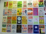
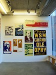
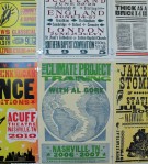
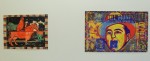
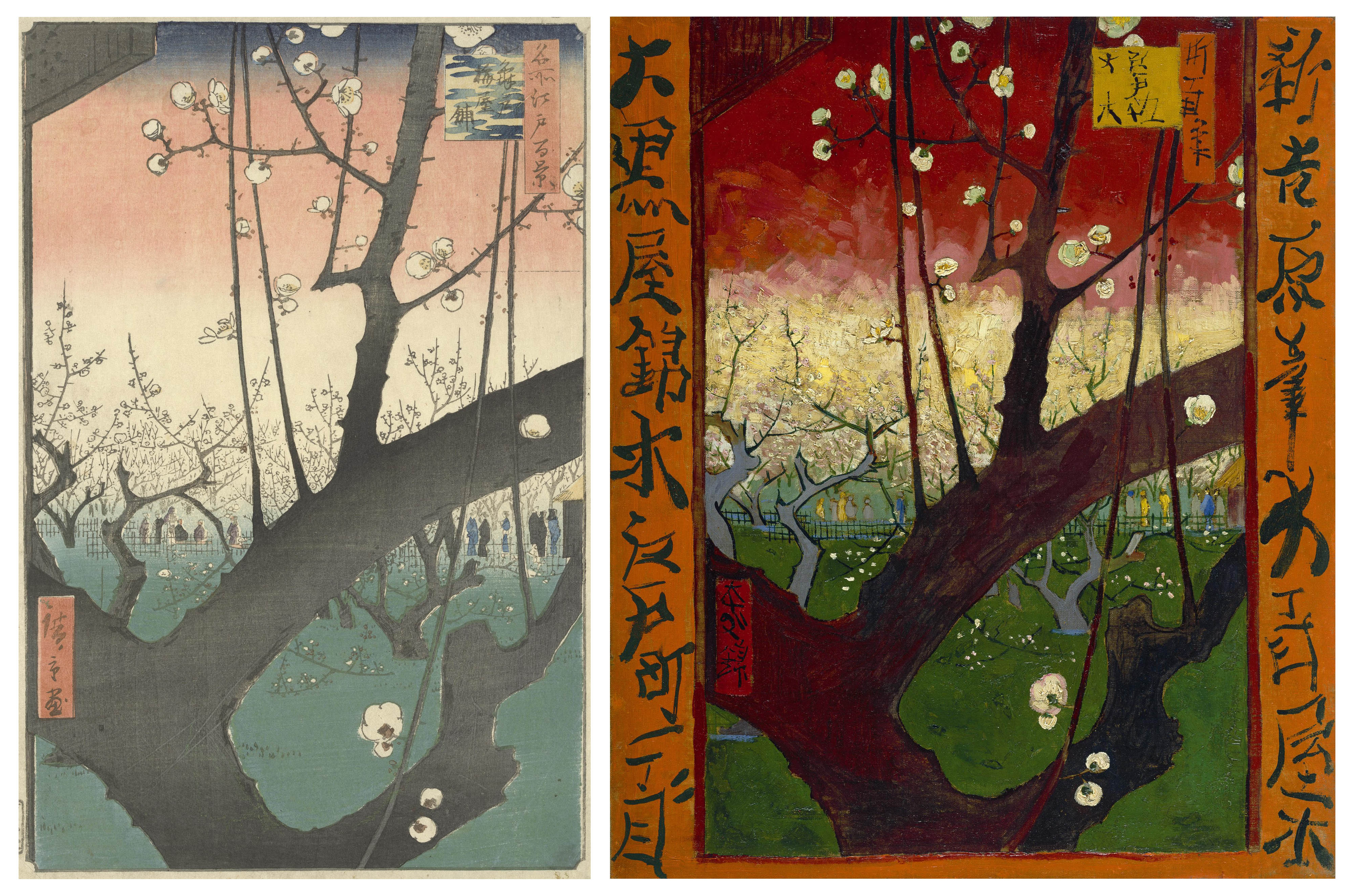
Today I was going through some old folders full of photographs I took while I was still at college and I discovered quite a few things that I was actually planning to write about but never did. For example, I remember in February I went to London for my university interview at Chelsea College of Art. (It was actually my first interview and I was really stressed) But after the interview I had a lot of spare time on my hands so I thought its a great opportunity to visit some Art Galleries without being rushed by anyone. Unfortunately my portfolio was so heavy that a barely could walk (I swear it wasn’t so heavy when I was leaving home!) So, in the end the only place I went to before going back home (Noooo..sooooo many things I could have done in London if I didn’t have this massive folder with me!) was a little University Gallery right next to it. So even though I didn’t get do anything exciting that day at least I was lucky enough to see all those awesome posters! And here they are:

I was also really happy because the weather in London was surprisingly nice that day!

Soo, thats it for today. Thank you for reading, I hope you liked all those great poster (of course you did!) and are looking forward my next post…maybe.. tomorrow?


Amsterdam

After a very long time of not posting anything as I was very busy writing an essay about Tradition and Originality as well as writing my personal statement which I think was even more difficult..and obviously applying for universities and preparing my portfolio I have finally decided that its time to catch up and start running this blog properly.

I think writing about our recent overseas trip to Amsterdam is a perfect way to start! The trip unfortunately was only 5 days long but it was enough to visit quite a few truly amazing museums and Galleries. It is really difficult for me to decide which place was my favourite but for now I’ll just say that I absolutely loved Vincent Van Gogh Museum. Firstly becasue I’m really interested in Japanese culture and seeing Japanese art influencing western Art and someone like Vincent Van Gogh is very fascinating. Secondly, I actually wrote about some of his works that were inspired by Japanese woodblock prints in my personal study which I was writing while I was at Sixth Form, and now I had an opportunity to see them in real life which was just amazing. 

 The picture on the left is an original print by Hiroshige and the one on the right is Flowering Plumtree (after Hiroshige) (1887) by Vincent Van Gogh. In his copy he changed the colour a little bit and added borders filled with calligraphic characters he borrowed from other prints. Later on I will write some more posts about all the different places we visited and about our exciting ‘Bike seat cover’ project but for now some photographs of Amsterdam.

Memory Palace – Exhibition Review


Memory Palace by Hari Kunzru
Over the summer I was asked to write an exhibition review on the exhibition of my choice. I looked up some different exhibitions in London and decided to visit V&A to see ‘Memory Palace’ and The British Museum to see ‘The Art Of Influence: Asian Propaganda’ I found both exhibitions very interesting but I though ‘Memory Palace’ was a way more exciting to write about. If you would like to read the review that I wrote then here it is!  Memory Palace-Exhibition Review Enjoy!

Back in college we were asked to design our reviews in a way that will make them look professional. Then we had to print 13 copies of our reviews so every student and can have one copy of each review. Our next task was to design a book cover for our hand-made books in which we were suppose to put all the reviews that we had.

I though this project was really exciting as at the end of it I had a self designed book where I could find 12 different opinions about different exhibitions, all written by the people I actually know.

This is the book cover and contents page that I created using InDesign. For my design I decided to use word ‘review’ 12 times as this is how many reviews I have in my book. The fact that each word ‘review’ is slightly different reflects the difference between all of the reviews that can be found in the book. I though it was an interesting way of expressing the content of the book through the visually appealing cover.

Some alternative designs that I created:

And the most exciting part! The final outcome:

Minimalist Prints

Field Trip to Aberystwyth in Wales

Aberystwyth is a small, beautiful town situated near the confluence of the rivers Ystwyth and Rheidol, on the west coast of Wales. I was lucky to be able to visit this wonderful place very recently as a field trip to Aberystwyth in Wales is a part of college induction for Foundation diploma in Art & Design students.

We spend wonderful time in there! And we all had a chance to get to know each other. We visited the biggest camera obscura,  placed our summer projects  – ships models in a Ceredigion Museum, and also looked at links between exhibits from two completely different exhibitions which i found really enjoyable!